Half Light Records — Label Identity System

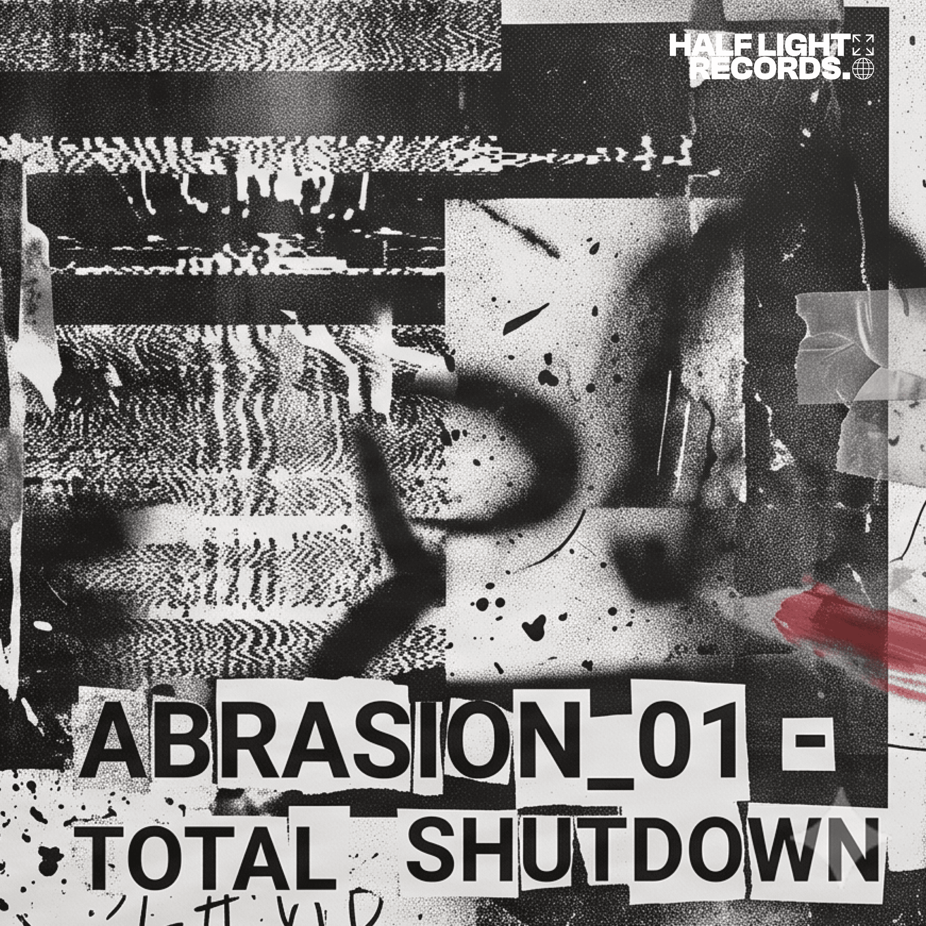

An identity system built to hold a record label's catalogue together without flattening any of it.
Half Light Records had ten records that sounded like they belonged together and looked like they came from ten different labels. The brief asked for a rebrand. The problem was a system. A label with an ambient record, a techno record, and a noise record in the same catalogue can't be held together by imposing one aesthetic over the top of everything — that solves the inconsistency by erasing what made the catalogue worth having. What it needs is an anchor: a mark confident enough to sit quietly behind wildly different sleeve art without competing with it, and a small set of rules the label can apply itself. The work was deciding which problem to solve, then proving the answer held under pressure.
Brief
A rebrand was asked for. A system was needed.
The ask was a rebrand: new logo, "underground but professional, like Warp but weirder," with three contradictory aesthetic references attached and a request to keep the existing lowercase wordmark. Eight weeks, tied to a compilation launch.
Three conflicting directions in one brief usually isn't indecision. It's a sign the client hasn't separated what the mark looks like from what the label feels like.
Three references, three layers.
Warp, Modern Love and PAN were studied for the same question: how does a label hold an inconsistent roster together without homogenising anyone?
The scoping resolution came out of it. The three references weren't competing directions to choose between — they were three layers of the same system. Anchor, System, Texture. Structural, not aesthetic; consistent, not identical; expressive, not decorative. That reframe made the rest of the project possible.
The first direction failed, usefully.
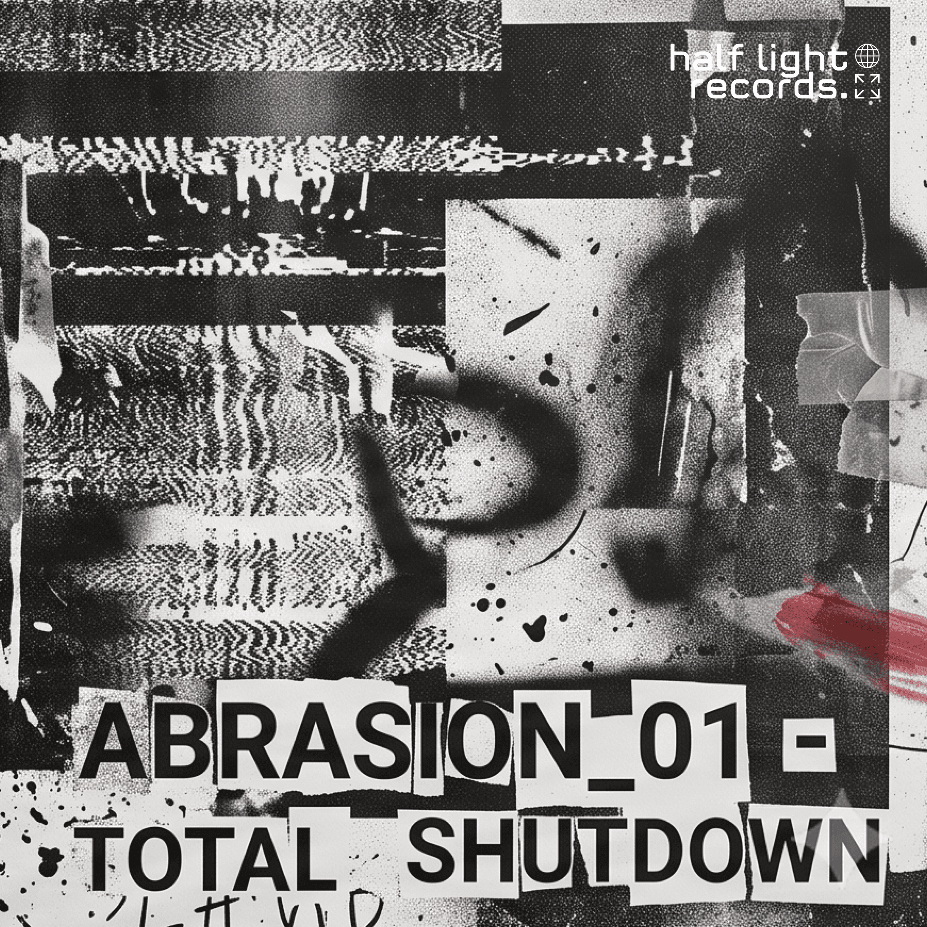
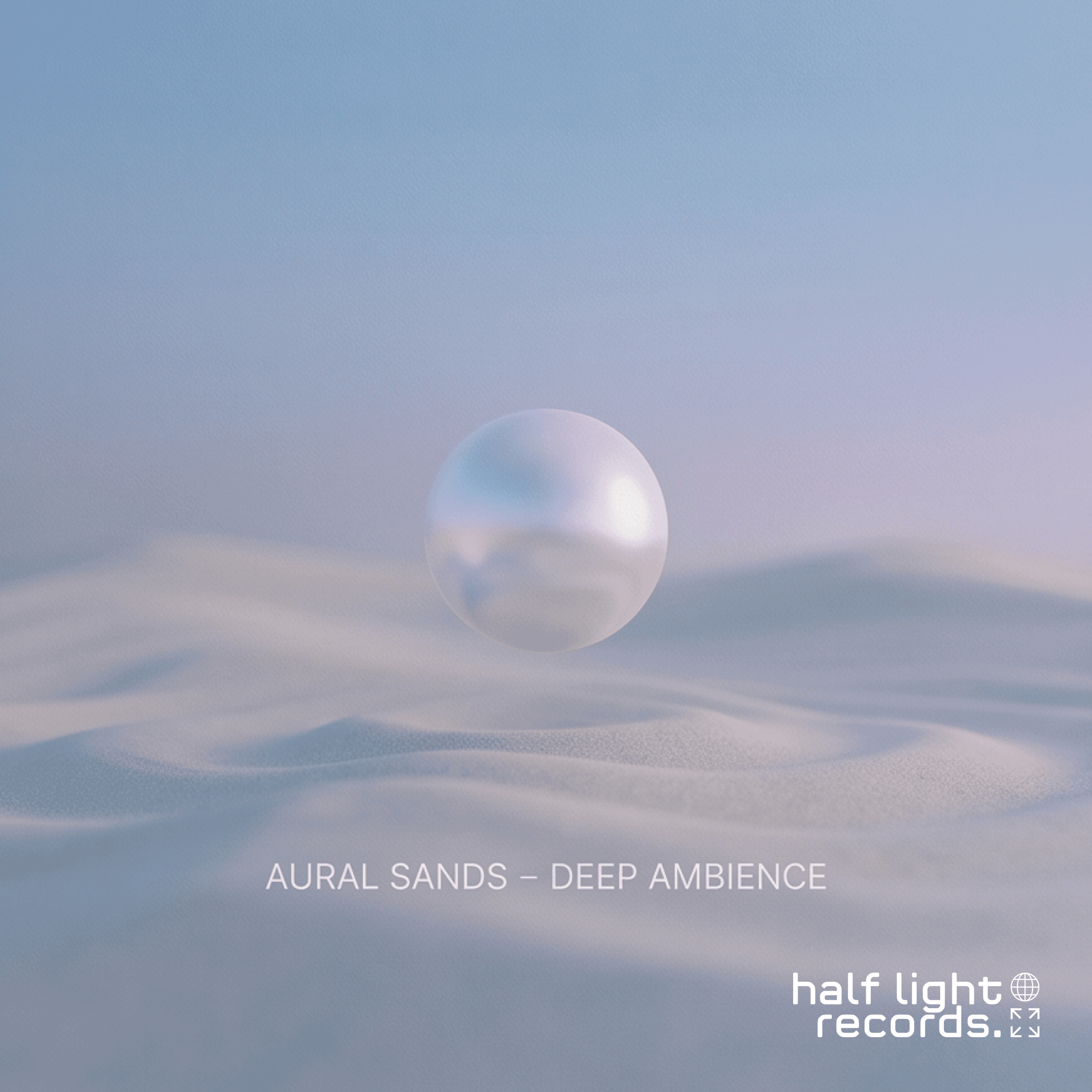
The first direction evolved the existing lowercase wordmark, honouring the client's attachment to it. It was tested against three imagined sleeves — ambient, techno, noise — rather than presented on a white background.
It held on two and broke on the third. The soft lowercase letterforms couldn't hold their own against a collage-and-glitch noise sleeve; the mark read closer to a friendly app than a record label. That failure was the useful part. It retired the direction on evidence rather than preference, which made the replacement defensible instead of merely preferred.
An anchor, then rules to govern it.
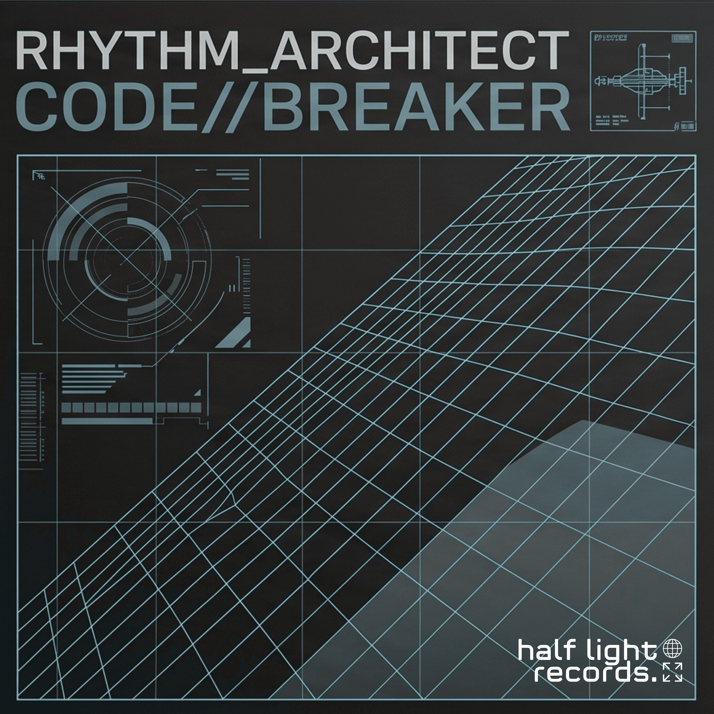
The bold condensed all-caps direction survived the noise sleeve. It became the Anchor.
Then it was governed. Two defined widths — 1000px and 650px — triggered by how busy the artwork behind the mark is, with height following the mark's true ratio rather than a rounded approximation that would have distorted it. Colour judged locally, behind the clear space, not globally across the sleeve. Placement bottom-right by default, centred for compilations. Clear space at one letterform height.
A third direction — the wordmark elevated on a frosted glass plinth — was the most striking of the three, and it was demoted. A translucent effect cannot reduce to a single flat colour, and the mark had to survive being stamped on vinyl. It survives as a Texture-layer flourish for full-colour placements only. The format constraint outranked the aesthetic preference.
A system the label can run without me.
Six final lockup files across three tiers, white and black. Three release templates — streaming cover, social, A2 poster. A five-page style guide the label can apply without hiring a designer for every release.
The alternate lockup was rebuilt during delivery. Tested at true favicon scale, its icons collapsed into illegible marks, which broke a rule the system had already locked. It became text-only, and the system gained a documented exception for sub-150px contexts rather than quietly contradicting itself.
Direction one — retired
Tested against all three sleeves. It held on ambient and techno; against the collage it gets swallowed. The delicate letterforms have nothing to push back with.
Direction two — the Anchor
Same artwork, same placement. The condensed caps hold their ground without shouting over the sleeve. This is the test the decision was made on, not a before-and-after.